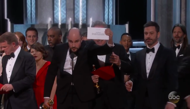
The 2017 Oscar ceremony brought a strange twist that could only have made Steve Harvey smile. The most anticipated award for Best Picture was first given to the movie, La La Land. After a several minutes long acceptance speech by La La Land's producers, the true winner of the night -- Moonlight -- was eventually announced. So the biggest question is: how did this happen and could it have been prevented?
The mistake has been attributed to two PwC accountants handing the wrong envelope to Warren Beatty and Faye Dunaway. During the presentation, Beatty clearly looks confused. Dunaway, thinking that her 1967 Bonnie and Clyde co-star was pausing for dramatic effect, makes the announcement for La La Land. Beatty explains when he read the card, he paused because it read Emma Stone. This could have been prevented provided certain redundancies were put in place. As embarrassing and painful as this must have been for everyone involved, we can always count on the internet to put its own hilarious take on things.
The Mistakes the Academy Made
The mistake the two PwC accountants made is understandable. So too is the mistake made by both Dunaway and Beatty. Given how hectic and stressful it must be to work behind the scenes while ensuring that everything runs smoothly, it is a surprise this has not happened more often. If anyone must be blamed, it should be the Academy of Motion Picture Arts and Sciences.
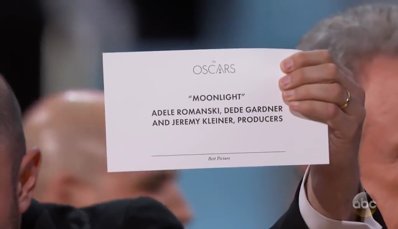
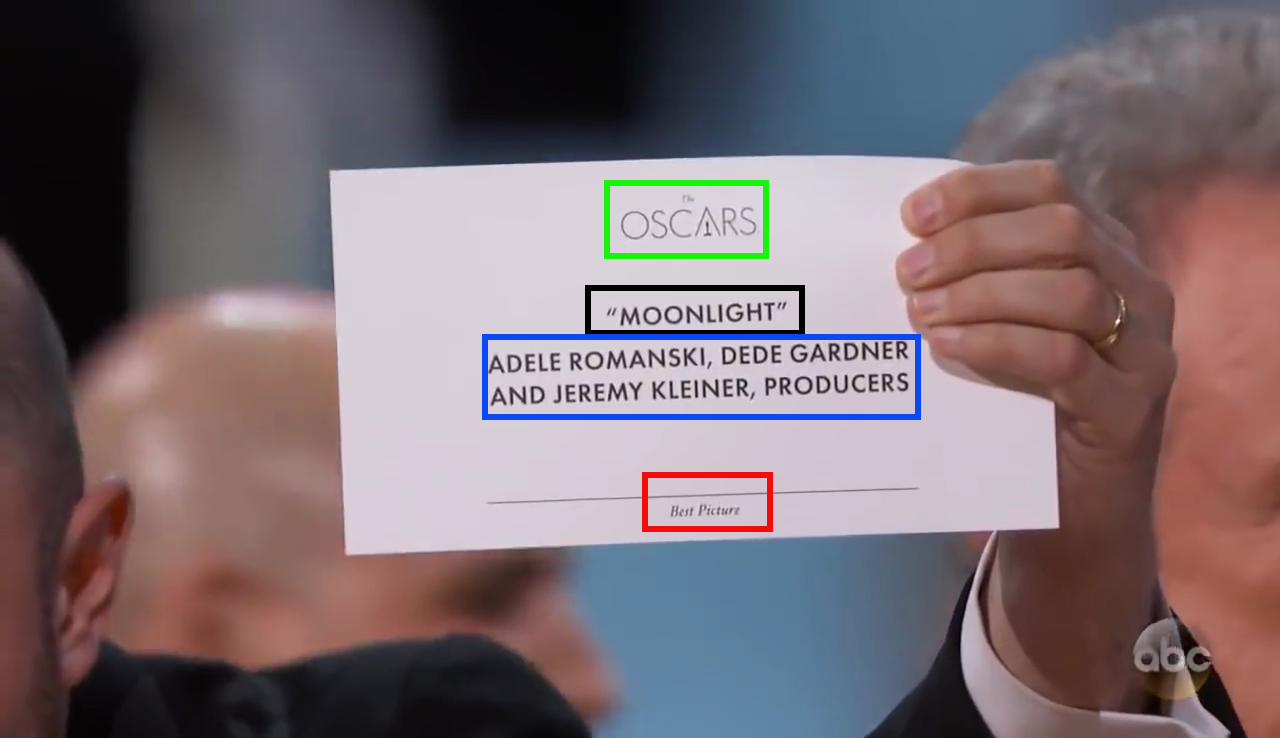
A screengrab from the ABC News YouTube video of the event shows the cue card. The design gives us some clues on why this mishap may have happened. The cue card for Best Picture has the movie title in the same font size, weight, and style as the film's list of producers. This makes distinguishing these two fields difficult at a glance. Good typography should make this effortless. The award being given is also not noticeable at first glance because the words Best Picture is written in small, italicized font at the bottom. In fact, most likely, you probably missed it. At least we know which awards ceremony we are watching as the words The Oscars is prominent on top.
Solving the Oscars' Cue Card Problem
Before we can propose a good card design, we need to establish some goals for the card. The card should, at a glance, tell the reader or announcer:
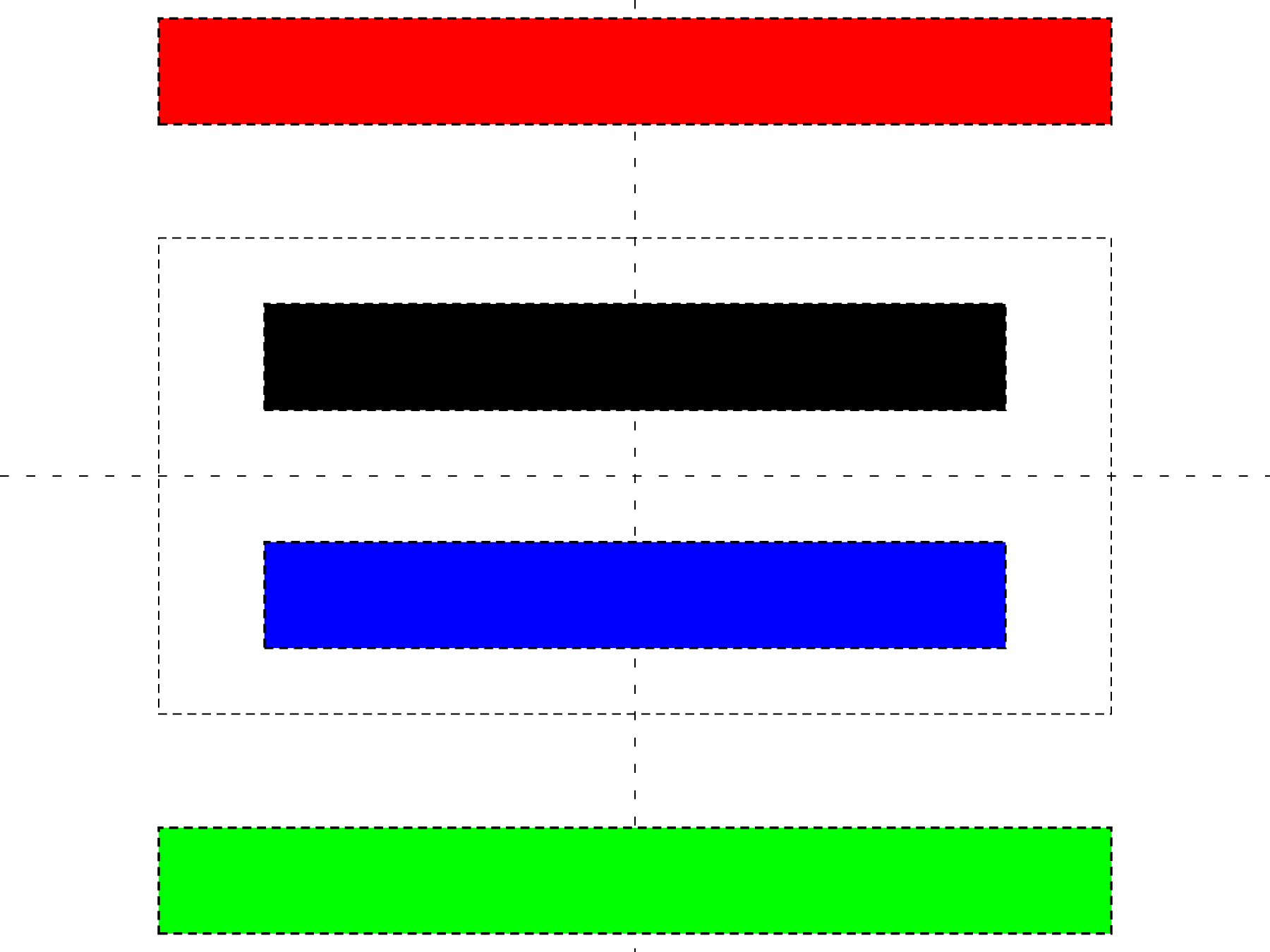
- The prize being awarded (red).
- The person, or film receiving the award (black).
- the ceremony (green).
In the case of the award being given to a person, the cue card should show the film that person worked on while for a film, it should list the people involved as well as their roles.
Next we figure out the level of importance each piece of information represents. A person reading the cue card will usually scan the card, their eyes focused on the middle of the card. They will announce the person who won the prize, followed by the film they were in. If the award is going to a film, that gets announced followed by the people who worked on the movie. These two are the most important pieces of information on the cue card. Next in importance is the prize being awarded. We can assume that the announcer will be told this before appearing on stage so this information exists for verification purposes. If this piece of information was more prominent on the cue card, either Dunaway or Beatty could have caught it and notified the PwC accountants. As odd as it sounds, the least important piece of information is the award ceremony. We all know which ceremony we are attending and this placement exists purely for branding purposes.
By varying a font's style, width, position, and weight, we can draw a reader's eye to what is important and what is not. We need to make the field highlighted in black the most prominent, followed by blue, then green, and lastly red. We also need to place this information in the center of the card. Steve Harvey's 2016 Miss Universe flub was also the result of bad design - the 2nd and 1st Runner Ups were placed on the left side of the cue card while the winner was placed on the bottom right. This poor placement meant that Harvey's hand was blocking the pageant's winner.
TikZ Code for an Oscars' Cue Card
|
1 2 3 4 5 6 7 8 9 10 11 12 13 14 15 16 17 18 19 20 21 22 23 24 |
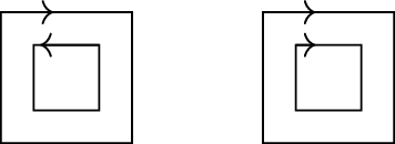
\begin{tikzpicture}[remember picture, overlay] \draw[loosely dashed] (current page.north) -- (current page.south); \draw[loosely dashed] (current page.west) -- (current page.east); \coordinate (A) at ($(current page.north)!0.5!(current page.center)$); \coordinate (C) at ($(current page.south)!0.5!(current page.center)$); \coordinate (B) at ($(current page.west)!0.25!(current page.center)$); \coordinate (D) at ($(current page.east)!0.25!(current page.center)$); \draw[densely dashed] (A) -| (B) |- (C) -| (D) |- (A); \coordinate (award) at ($(current page.north)!0.15!(current page.center)$); \node (awardtext) at ($(current page.north)!0.15!(current page.center)$) [draw,densely dashed,minimum width=4.5in,minimum height=0.5in, fill=red, thick] {}; \node (ceremony) at ($(current page.south)!0.15!(current page.center)$) [draw,densely dashed,minimum width=4.5in,minimum height=0.5in, fill=green, thick] {}; \node (winner) at ($(A)!0.50!(current page.center)$) [draw,densely dashed,minimum width=3.5in,minimum height=0.5in, fill=black, thick] {}; \node (film) at ($(C)!0.50!(current page.center)$) [draw,densely dashed,minimum width=3.5in,minimum height=0.5in, fill=blue, thick] {}; \end{tikzpicture} |
We can code this in the LaTeX graphics package, TikZ. We want to put the information that an announcer needs to read in the center of the card. This is where their eyes will focus as they pick up the cue card to look at it. We can change the font's weight and size to further highlight and draw an announcer's eyes to what is important.
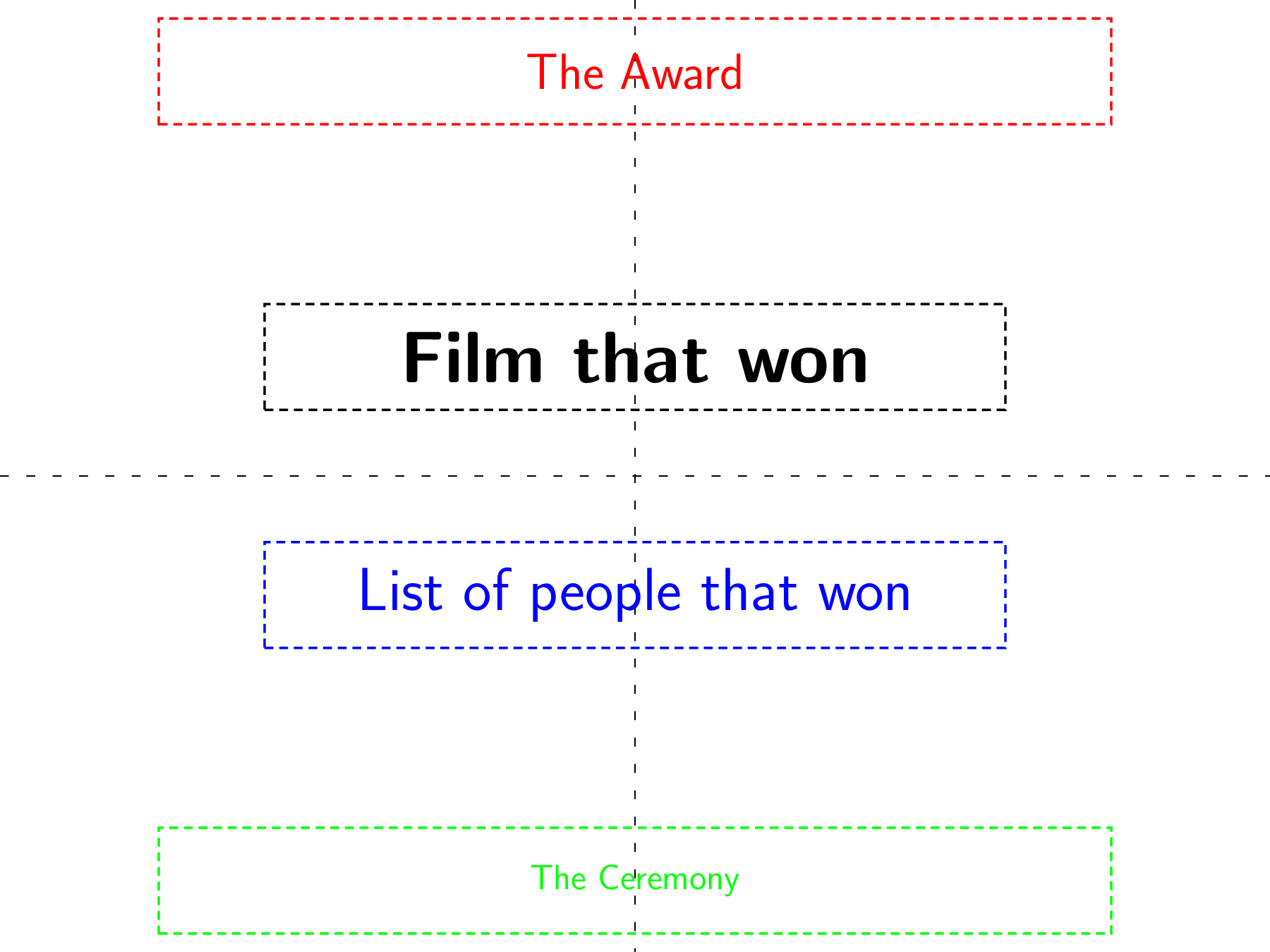
Our final card looks something like this. We are going to make the font for the person/film that won the largest and in bold. The font for the next piece of information will be smaller and not bold. The font for the award will be smaller still but still large enough that it can be seen and read easily. Last, the font for the ceremony will be the smallest size. The Academy will probably object to this but we aren't marketing a product where branding is important. We have an award ceremony to run.
|
1 2 3 4 5 6 7 8 9 10 11 12 13 14 15 16 17 18 19 20 21 22 23 24 |
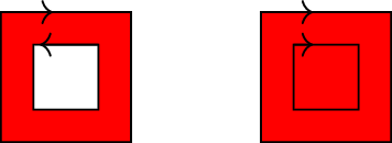
\begin{tikzpicture}[remember picture, overlay] \draw[loosely dashed] (current page.north) -- (current page.south); \draw[loosely dashed] (current page.west) -- (current page.east); \coordinate (A) at ($(current page.north)!0.5!(current page.center)$); \coordinate (C) at ($(current page.south)!0.5!(current page.center)$); \coordinate (B) at ($(current page.west)!0.25!(current page.center)$); \coordinate (D) at ($(current page.east)!0.25!(current page.center)$); % \draw[densely dashed] (A) -| (B) |- (C) -| (D) |- (A); \coordinate (award) at ($(current page.north)!0.15!(current page.center)$); \node (award) at ($(current page.north)!0.15!(current page.center)$) [draw,densely dashed,minimum width=4.5in,minimum height=0.5in, red, thick] {{\LARGE \sffamily The Award}}; \node (ceremony) at ($(current page.south)!0.15!(current page.center)$) [draw,densely dashed,minimum width=4.5in,minimum height=0.5in, green, thick] {{\large \sffamily The Ceremony}}; \node (winner) at ($(A)!0.50!(current page.center)$) [draw,densely dashed,minimum width=3.5in,minimum height=0.5in, black, thick] {{\Huge \bfseries \sffamily Film that won}}; \node (film) at ($(C)!0.50!(current page.center)$) [draw,densely dashed,minimum width=3.5in,minimum height=0.5in, blue, thick] {{\huge \sffamily List of people that won}}; \end{tikzpicture} |
Proposing a Layout
|
1 2 3 4 5 6 7 8 9 10 11 12 13 14 15 16 17 18 19 20 21 |
\begin{tikzpicture}[remember picture, overlay] \coordinate (A) at ($(current page.north)!0.5!(current page.center)$); \coordinate (C) at ($(current page.south)!0.5!(current page.center)$); \coordinate (B) at ($(current page.west)!0.25!(current page.center)$); \coordinate (D) at ($(current page.east)!0.25!(current page.center)$); \coordinate (award) at ($(current page.north)!0.15!(current page.center)$); \node (award) at ($(current page.north)!0.15!(current page.center)$) [minimum width=4.5in,minimum height=0.5in] {{\LARGE \sffamily \itshape Best Picture}}; \node (ceremony) at ($(current page.south)!0.15!(current page.center)$) [minimum width=4.5in,minimum height=0.5in] {\includegraphics[width=0.25\textwidth]{./the_oscars}}; \node (winner) at ($(A)!0.50!(current page.center)$) [align=center, text width=3.5in, minimum height=0.5in, black, thick] {{\Huge \bfseries \sffamily Moonlight}}; \node (film) at ($(C)!0.50!(current page.center)$) [align=center, text width=3.5in, minimum height=0.5in] {{\huge \sffamily Adele Romanski, Dede Gardner, and Jeremy Kleiner, Producers}}; \end{tikzpicture} |
Now that we have established our goals and how they should be laid out, we can propose a card design. The font for the ceremony can be replaced by a logo and to add a little more emphasis for the award, we can put that in italics.
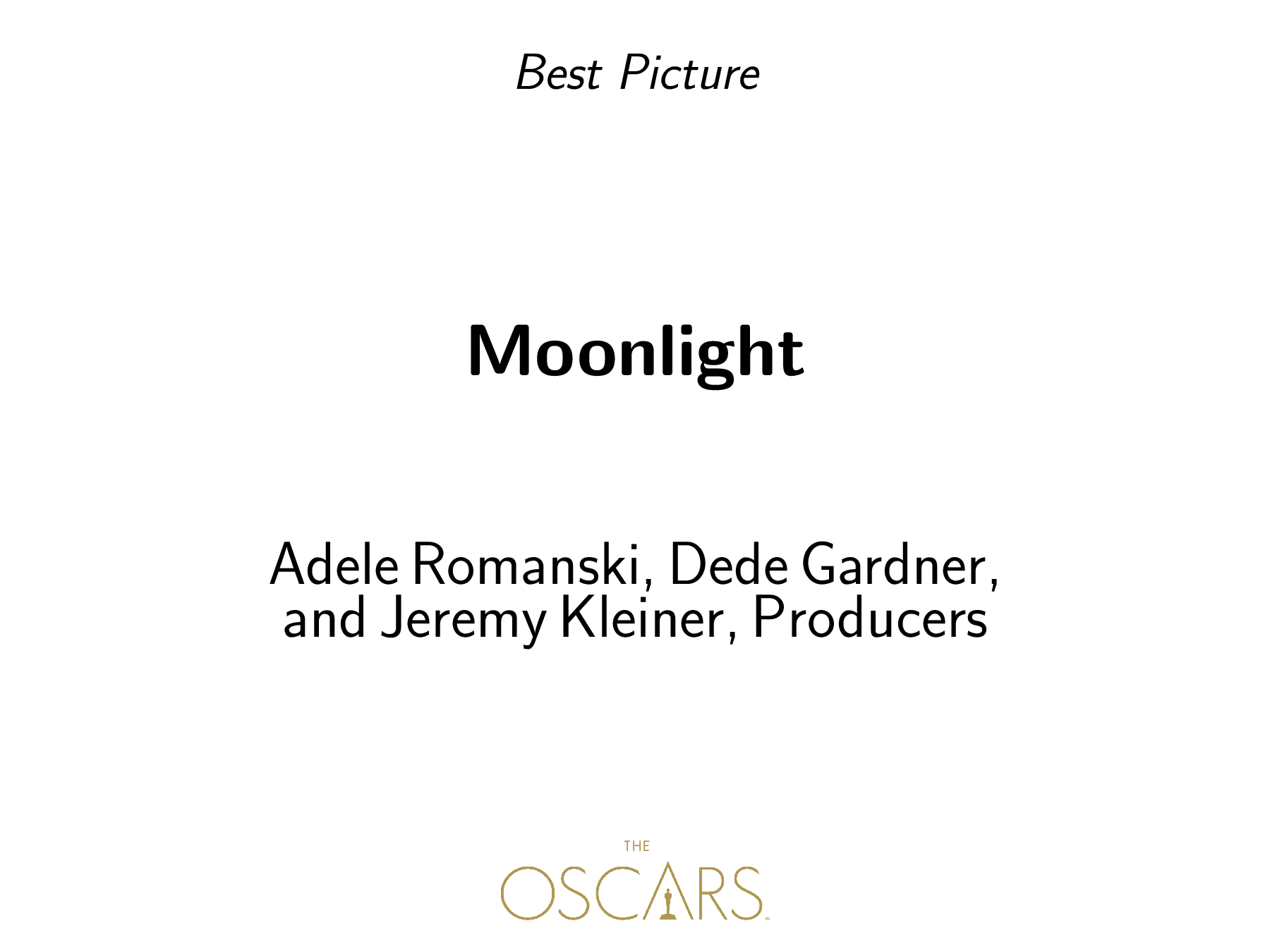
This should make things easier to read. The person announcing the award can tell, at a glance, the award they are supposed to read as well as who won that award. If they are not sure, the fact that they are announcing Best Picture can easily be seen above and the logo, while smaller, is noticeable to keep the Academy happy.
Going Further... Automation
We can go even further once we have everything in place. With LaTeX, we can create macros for each field and a new environment to contain it all. This will allow us to automate the process of creating cue cards.
|
1 2 3 4 5 6 7 8 9 10 11 12 13 14 15 16 17 |
\begin{documnet} \begin{cuecard} \award{Best Picture} \winner{Moonlight} \awardee{Adele Romanski, Dede Gardner, and Jeremy Kleiner, Producers} \end{cuecard} \begin{cuecard} \award{Best Actress} \winner{La La Land} \awardee{Emma Stone} \end{cuecard} \end{document} |
Each new cuecard environment will typeset a new cuecard. There are packages that allow us to merge data from a CSV file in LaTeX, but we can also go for a fully automated solution, using something like Python or the R statistical language to query a database and generate the LaTeX code to typeset as many cuecards as you need. The LaTeX code can then be executed and the resulting cue cards printed.
Conclusion
We may not often think it but good typography matters. It makes reading effortless. It allows the reader to focus on what is needed and extract that information. The flub on Sunday night's ceremony was a result of poor typography and card design. A well-designed card means that either Dunaway or Beatty would have seen they were given the incorrect card and asked for a new one.